
Profile Analyzer
Menu: Tools » Analyzer
Roasters often want to analyze their roasts to measure consistency, look for aspects of the profile that can be improved, and to create metrics to score the roast against a set quality measures. Artisan has many ways to provide information on a roast, including the Statistics Summary, Plotter and Math tabs, AUC (area under the curve), and many others.
The Analyzer is a combination of several tools to help a roaster Analyze segments of their roasts. The first is a curve fit tool. While it is similar to the Math tools that were introduced in Artisan many years ago, the Analyzer is greatly enhanced. The Analyzer can compute and fit three different mathematical curves to a profile’s BT curve. The computed curve fit BT is placed in the background along with the curve fit RoR (ΔBT). The computed curve is then compared to the profile’s BT curve. A summary table is presented that provides detailed information about the quality of the fit. The Analyzer can also compare the profile’s BT to any given background curve.
An Example
Let’s look at an example before going into more detail. The BT curve below is fit to an x² curve. To simplify things the ET curve is not shown, the background curves are shown in red and have been widened to be more visible.
Note: Use menu Config » Colors to change a curve’s color and click the little graph icon on the navigation toolbar to change the width of a curve.
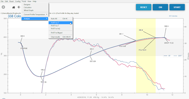
Notice that this profile has an existing background curve that will be replaced by the fit curve. The original file is not touched. Artisan will warn and guide you if you try to save on top of your original file.
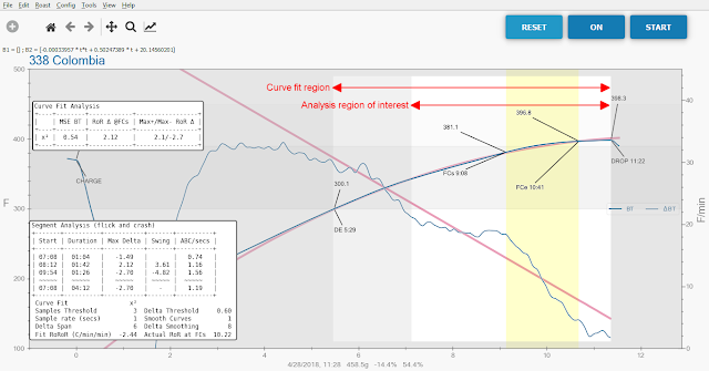
Note: The first time the Analyzer is run the result boxes will probably be on top of each other and the graph. Simply drag them to another position, Artisan will remember where you placed them.
There are several things to notice when the Analyzer finishes. Two boxes display the results, as explained later. A grey mask highlights the region over which the curve fit was performed. There is an inner masked area that indicates the interval of interest over which all the metrics calculations are performed. The start time of each region can be set on the Config » Curves, Analyze tab. The end of both regions is always the DROP time.
Note: Depending upon the color theme in use, especially for darker themes, the analysis mask areas may be easier to see by unchecking Config » Phases, Watermarks.
The upper box in the screen shot shows a table of curve fit results. Remember that this example fits the BT to an x² curve. That means the curve fit RoR will be a straight line. The MSE BT value is a measure of how closely the profile compares to the linear (straight line) RoR. A perfect match between the profile BT and the curve fit BT would show a MSE of zero. Larger numbers indicate a less precise match. A description of each column is at the end of this page.
The lower box provides metrics that indicate the severity of RoR rises and crashes in the profile. Each line in the table is a segment of the profile RoR (ΔBT) throughout the interval of interest. A segment starts and ends when the RoR crosses the curve fit RoR. In this example the first segment begins at 07:08. The time 07:08 is when the interval of interest begins. The RoR at this time is below the curve fit RoR. At 08:12 the RoR crosses the curve fit RoR beginning the second segment. The third segment starts at 09:54 when the RoR again crosses the curve fit RoR. The right most column, ABC/secs, is the area between the curves divided by the number of seconds. This is a good indicator of rises and crashes. The second and third segments show ABC/secs larger than 1.0 indicating a noticeable rise and crash.
What’s a good result using x²: Under .10 on MSE BT is a very good roast and between .10 and .30 is a solid roast, but remember that the smoothing and delta span values affect the results in a big way, so it is possible to have a .10 curve that isn’t great. The ranges assume little smoothing and low delta spans. If you have lots of segments that is also better than fewer, so long as the Max Deltas are small. It means the ΔBT is sticking close to the ideal.
Note: The Analyzer always calculates and reports using Celsius. This provides a consistent set of units for comparison and sharing of Analyzer results.
Segments
Let’s look at another example to see how the analyzer combines segments to make analysis easier. Segments start and end when the profile RoR crosses the curve fit RoR. Sometimes they are short in duration or small in amplitude. The Analyzer will automatically combine such segments with the one to the left (earlier) based upon the Analyze Options on the Config » Curves, Analyze tab.
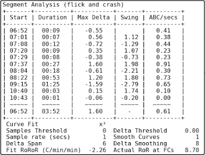
In the example below, which was fit to an x² curve, the BT RoR goes above and below the curve fit RoR several times.
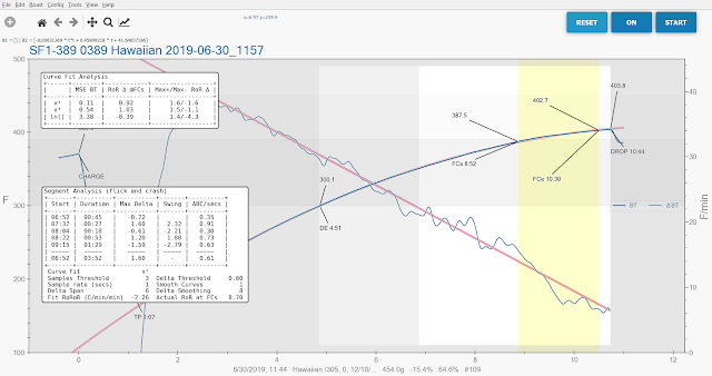
Notice that the Segment Analysis table shows 5 segments. Looking at the curves there are more more times the profile RoR crosses the fit RoR. The Analyze Options used for this analysis regards 3 or fewer samples as not significant and a difference between the two RoR curves of 0.6 as not significant. As a result the analyzer has combined some segments to the left. Look now at the third segment that begins at 08:04. It has a Max Delta of -0.61. This is just above the Delta Threshold of 0.6 (the threshold is an absolute value). If the setting is changed to 0.61 the following table results. This is a good setting for this profile.
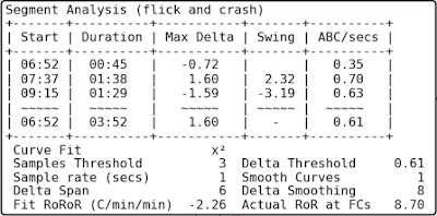
To see all of the segments set both Analyze Options to zero. The table below shows all the segments.
Auto All
The Auto All option on the Tools » Analyze menu will fit three different curves to the profile BT. It fits x², x³, and ln() curves. The x² fit will be displayed in the graph after Auto All has completed. The curve fit results for all three fit types will be shown in the Curve Fit Analysis box. The results are sorted in ascending order of MSE BT. The Segment Analysis box will show results for the x² fit.
Fit to any chosen background
The Analyzer can compare the profile BT to any background curve. Be sure the desired background BT is displayed in the graph and choose “Fit BT to Bkgnd” from the Tools » Analyze menu.
After you are done with Analyzer you can clear the results by using Tools » Analyze » Clear Results. You will see the fit curve and not your original background curve. If you like, you can Switch Profiles under the Roast menu, and save the fit curve to use later as an “ideal” background. If you want to get the original background curve to show again either reload the profile that includes the background, or directly load a background from Roast » Background » Load.
Description of the Fields
Curve Fit Table Fields:
First column : The curve fit type.
MSE BT : The mean square error (difference) between BT and the curve fit BT. The closer to zero the better the fit.
RoR Δ @FCs : The difference between BT RoR and curve fit RoR at first crack start time. If the value is “nan” (not a number) then the RoR @FCs could not be uniquely found. This may happen with curves that look very digital. Increasing smoothing or delta span may cure this.
Max+/Max- RoR Δ : The maximum arithmetic difference between BT RoR (ΔBT) and curve fit RoR. The Max+ is the greatest difference when BT RoR is above (greater than) the curve fit RoR. The Max- is the greatest difference when BT RoR is below (less than) the curve fit RoR.
Segment Table (rise and crash) Fields:
Start : Start time of the segment.
Duration : Length of the segment in mm:ss.
Max Delta : The maximum difference between actual RoR and fit RoR for the segment.
Swing : The difference between the previous segment’s Max Delta and this segment’s Max Delta.
ABC/secs : The Area Between the Curves divided by the number of seconds in the segment. The Analyzer calculates the area between the BT RoR and the curve fit RoR for each segment and divides that area by segment number of seconds. This value is indicative of the severity of a rise or crash. The closer to zero the better.
Optional settings (Config » Curves, Analyze tab)
Curve Fit and Interval of Interest Options
Start of Curve Fit Window : This is the time when the curve fit begins. The curve fit will be performed using the BT data from this time until DROP.
Custom offset seconds from CHARGE : If “Custom” is chosen for Start of Curve Fit Window, the curve fit will start this number of seconds after CHARGE.
Interval of Interest Options
Start of Analyze interval of interest : This is the time when the interval of interest begins. Calculations and results from the Analyzer are performed starting at this time and ending at DROP. The Start of Analyze interval of interest must not be earlier than Start of Curve Fit Window. If it is set earlier a warning message will be displayed when running the Analyzer.
Custom offset seconds from CHARGE : If “Custom” is chosen for Start of Analyze interval of interest, the interval of interest will start this number of seconds after CHARGE.
Analyze Options
Number of samples considered significant: When performing segment analysis the Analyzer combines short segments that are not considered significant. If a segment is this number or less samples it will automatically be combined with the previous segment. This setting is shown below the Segment Analysis table with the label “Samples Threshold”.
Delta RoR Actual-to-Fit considered significant: When performing segment analysis the Analyzer combines segments where the profile RoR is near to the fit RoR for the duration of the segment. If the absolute value if the difference between the profile RoR and the fit RoR is this value or less the segment will automatically be combined with the previous segment. This setting is shown below the Segment Analysis table with the label “Delta Threshold”.